Tricks and Tips For Designing Your Grey Bathroom
Many of our clients that have fallen for the Scandinavian influence, becoming entranced with the grey palette for their interior projects. Be it for living rooms, bedrooms, kitchens or bathrooms. However, our worldly neighbours usually have larger rooms. The British climate mixed with our smaller bathrooms can make it tricky to get this trend right.
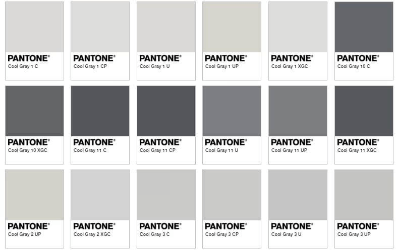
To simplify the world of ‘choosing your grey’, the tone is generally based in two colours – brown and blue. Bluer greys, such as silvers tend to feel cooler and work well with dark shades like black, along with textures in brushed chrome. Whereas, browner greys such as taupe and mink, often lend themselves to warmer pairings like wood effects and nickel. So, if your bathroom doesn’t find much sunlight during the day, a warmer tone might help lift that a little. Or, if you’re on the search for a cave-like retreat, then perhaps the cooler temperature is where you’ll find your match.
Nowadays, the debate between couples over their Pinterest boards that we are sent, lies in deciding between these two (not fifty!) shades of grey.
Knowing how to make either palette work is key to helping you decide which works for your lifestyle, interior styling preferences and the mood you want to capture. Essentially either tone can create the perfect bathroom, providing it works for you. This is where using a Designer such as ourselves can really add value and transform your bathroom renovation project – being able to visualise the differences in 3D renders will help make these key decisions when it comes to tile colours, furniture textures and tap finishes.
To start with, we delve into the warmer shades on offer. In this category we’ll find Mink, Taupe, and Greige. If you’re not submerged within the interior design world, it can be difficult keeping up with trends, or knowing what the best products are within the world of bathrooms. By the time completed bathrooms make it onto Pinterest and Instagram, it is highly likely another range or product has come on the market that could give your bathroom that unique edge over a Pinterest copy-and-paste post.
Warm Grey Palette
Our advice when it comes to any palette, not just in the realms of grey, is to ensure that you don’t just look at each individual item as solitary; but rather keep an eye on how all these finishes and textures will work together to create an overall ‘look’ – a concept.
When working with clients, we encourage them to use sites such as Houzz and Pinterest as starting points for their research. Start by pinning any image that speaks to you in some way. The key thing to remember is that you’re not looking for your dream finished bathroom in one image – if you find it, amazing! However, if you don’t, do not fret! The way to use these platforms is to browse the photographs and images on offer and then pin or highlight anything that jumps out at you. This could be a basin unit, type of wood, tile, accessory, tap shape, shower, bath etc. Remember, don’t overwhelm yourself by committing to finding an entire bathroom. Believe it or not, showing us a tap you like can generally give us a sense of what other items, colours and textures you may lean towards. Using Pinterest and Houzz can help when choosing your ‘grey’ and we, as designers, will integrate that into an overall concept.
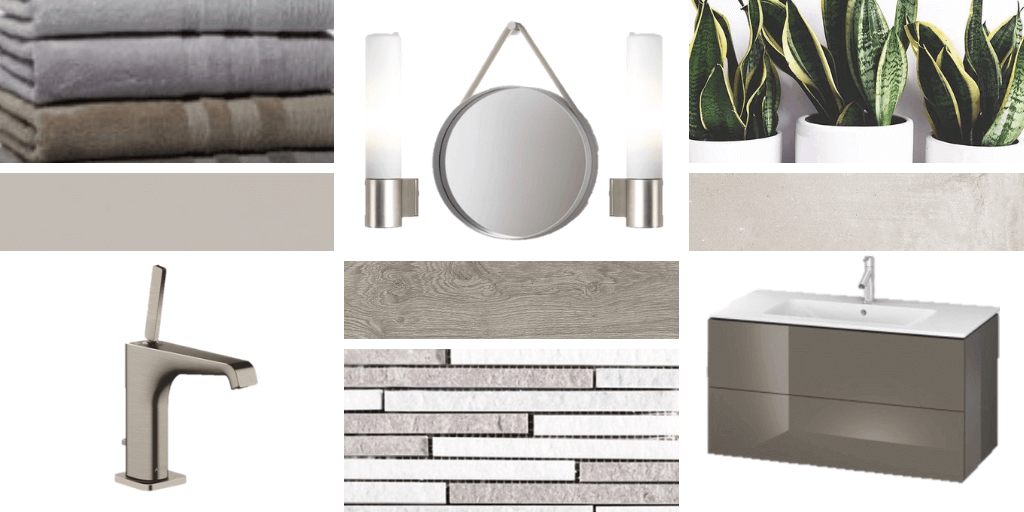
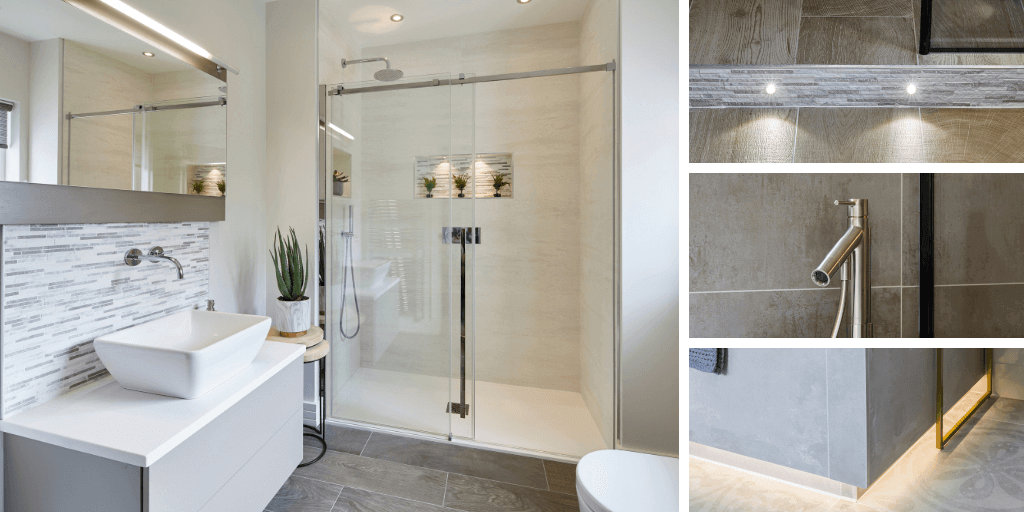
Below is the first example of a warm grey palette. As you can see, we’ve pulled together stonier colours for the paint, combined that with concrete and acero wood effect tiles, and finished it with brushed nickel taps, lights, and a mink gloss vanity unit.
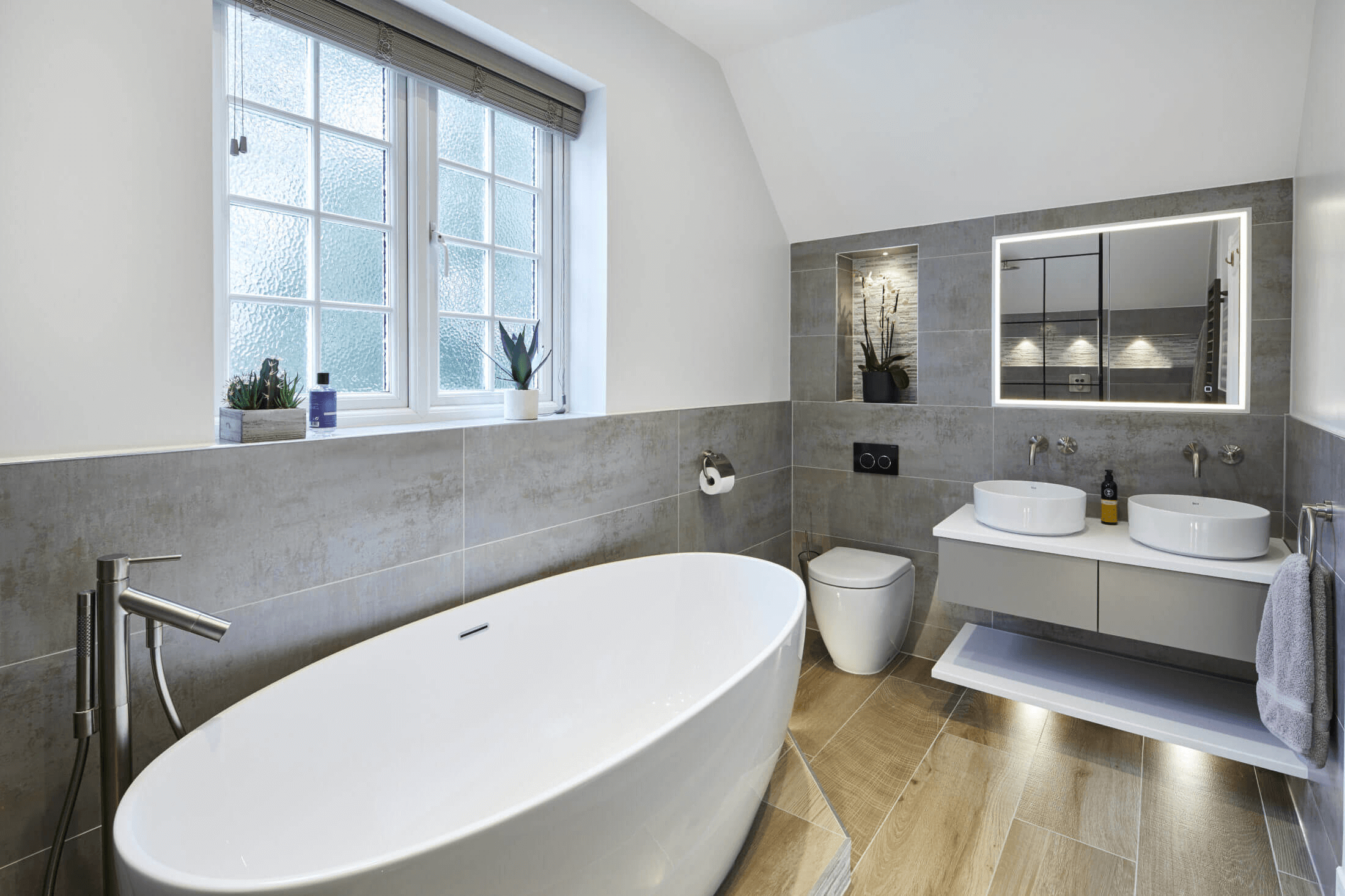
You can also see this coming into effect in a recent project we finished in Long Ditton.
Cool Grey Palette
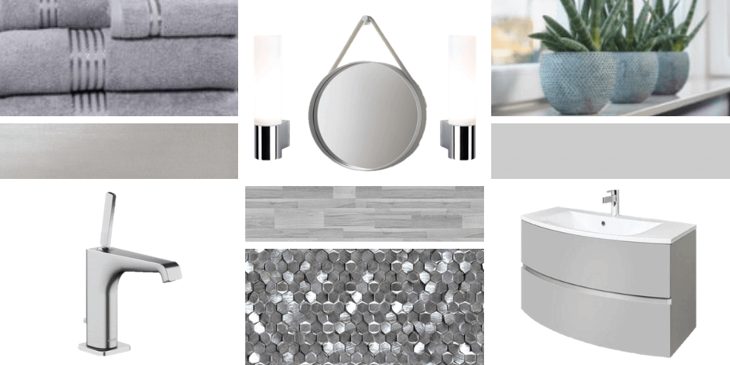
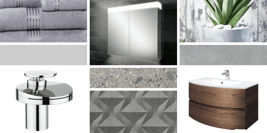
The cooler grey tone doesn’t have to mean ‘cold’. By implementing silvery greys and combinations with chrome or brushed chrome, together with lighter tones of grey bring a classy and softer vibe to a room. Cool doesn’t have to mean stark.
As shown in this mood board, combining a metallic effect wall tile with a gravity mosaic from Porcelanosa adds a contemporary feel to the room. The addition of wood effect tiles creates a softer touch while keeping the cool grey vibe. This helps this transition into the overall concept. The final touch for a room of this tone can be adding lesser known finishes to the taps such as brushed chrome – a bright and light finish which offers a metallic alternative to white taps.
The Crossover Palette
There are occasions when our clients love the cooler grey palette, yet they want to lift it with a touch of warmth. Pinterest is filled with suggestions on how to do this. As a matter of fact, we implemented this very concept into our own showroom in Long Ditton, Surrey. Here’s how we did it:
The simplest way to add warmth to any room, regardless of colour or tone – is by implementing wood effects. Reinforcing the prominence and popularity of ‘outdoors-in’ and creating a ‘natural’ vibe; wood effects can add a softer contrast to any stone, concrete or marble. Instantly warming a room when the right tone is added. In our showroom, we used a deep walnut against concrete tones of the Saloni Street Art wall tiles. Finishing this with the Ceppo Stone tile from Porcelanosa allowed a cross blending of the warmth of the vanity unit with the coolness of the wall tiles and finished it off perfectly.
Finishing Touches
As with any bathroom, the finishing touches can really be the last dot over the ‘i’ or cross on the ‘T’. It goes without saying that lighting is a huge contributing factor to the ambience of a room. As with the grey palette, lighting comes with two options – cool or warm light (ignoring the option of coloured lights, of course).
If you are hoping to add warmth to any room, opting for the mellow yellower notes of warm lighting will help make a room feel cosy. If you’re looking for a touch of drama or prefer a brighter ‘daylight’ feel to your room, then the cooler lights may be the right choice for you. However, many of the illuminating cabinets and mirrors that we use in our designs at Bathroom Eleven have both options programmed into them. Allowing you to switch between them depending on what you require it for. Having this option in your cabinet or mirror is beneficial, as generally speaking, the cooler ‘white’ light is perfect for your more practical day-to-day grooming; such as brushing teeth or shaving. The warmer light gives a softer glow for a more ambient feel, helping you to relax and unwind.
Goodbye Grey?
One thing that often concerns our clients , particularly those that haven’t found their forever home, is sale-ability. Personally, we don’ think that the grey ‘trend’ is going anywhere any time soon. It doesn’t feel that long ago that beige and brown was at the forefront of home styling. We do still get asked for those warmer pallets, so grey is still a relatively ‘new’ concept. More-so, if you bear in mind that a homeowner would generally renovate their bathroom around every fifteen years – so that’s quite the life cycle for any trend to work through.
Furthermore, an important thing to consider is that brands and designers know this. Grey doesn’t just mean grey walls, floor, and vanity. As you can see, there is a whole world of product that challenges the grey theme and tries to take it somewhere new. With the introduction of new finishes, more elaborate textures, geometric shapes, your ‘grey’ bathroom can be entirely unique to you if you want it to be – and at Bathroom Eleven, we challenge ourselves as designers to make every bathroom one-of-a-kind and special to each client individually.
So, if you are looking to start your renovation project and would like to know how it all works, do get in touch and book your complementary design consultation with one of our designers.a We are more than happy to introduce you to the world of bathrooms and create your dream ‘grey’ concept.
